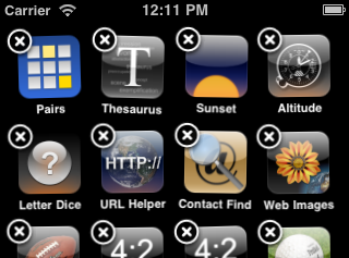
Unfortunately with the new features introduced in the latest versions of iOS Apple abandoned this principle itself. It all started with the UI to change and reorder app icons on the home screen. A long press on an icon in order to make it jiggle is not intuitive at all:

OK, once you saw it, you won't forget it but almost nobody finds out about it on their own. You will easily find quite a few in your non tech savvy circle of friends which didn't know about that feature until you showed them.
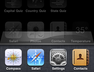
Fortunately home screen icon management seems to be a feature many don't miss. But things became worse with the addition of multitasking in iOS 4. The long press on the home button to activate the task bar of running apps is way beyond being intuitive:

(So far I got quite a few support calls about how to stop or restart hanging apps)
In order to help new and non tech savvy users Apple should follow its own principles by adding a visual element for these tasks (icon jiggle and task manager). There could be a special icon on the home screen which activates the jiggle mode:
To make it easy to find it could be placed on the always visible quick start bar which itself could have a special element at the bottom to activate the task manager:

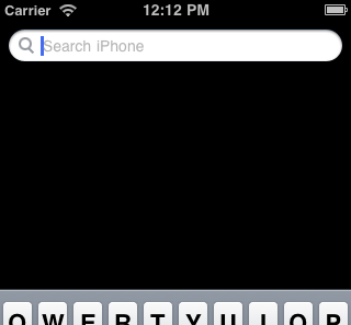
Another good place to start the task manager would be the search page (the most left home screen page). There is enough empty space below the search bar for a list of running apps:

Apple just added a developer preview of several more finger gestures to quickly switch between apps and activate the task bar. While these are great new features for powers users Apple should try to keep the iOS platform as attractive as possible for new users as well.
1 comment:
i hope apple listens to your request. a lot of OTHER people would want the same changes you want too ~
Post a Comment